 Here is the link to my RAZE FILM POSTER
To ensure that a product brand was established we used the same location for the setting of our film poster of the image used in the Empire magazine cover as well as the same font 'Distorted and Scratchy'. We also wanted to convey the narrative of the film, a long with the mood and atmosphere of the film, conveying Erin's lonely and troubled lifestyle created by the problems at home and school, leading her to turn to violence and aggression as her only way of self expression which penultimately leads to her becoming even lonelier living on the streets of the inner city she calls home.
 We placed the model to the right of the image, as the eye is immediately drawn to the top left hand corner of an image, due to the fact in English we read from left to right, therefore by placing the title of the film in the most important part of the overall image it makes it more memorable and the first thing that the eye is drawn to. As the image used for the magazine cover was very connective, with the actor looking directly into the camera, we wanted a counter image, which emphasised the inner city location of the film, so that the audience are able to establish an idea of the area that the lead character is from, as well as ensuring that the target audience can also associate their own lives with the film, making it relatable.
We got the actor to wear the hoody that she wears in the last shot of the film trailer where she lifts her head up to look into the camera and places her black hood over her head however took this image from a side on view of this shot, again creating texts and film that have coherance and an established image and brand. The dark figure of the actor is seen as being alone against the vast empty grimey subway that she has been forced to take refuge in, again emphasising her loneliness and the vulnerability many youths in these areas may face, also setting the scene and creating a mood and general mise en scene for the whole film.
 We chose to use the subway for this photo shoot location as it establishes a setting and stereotype immediately, as well as the use of dark clothing and the use of dress codes including a 'hoody' which is stereotyped as the media as being associated with economically and socially deprived youths of inner city areas, many of which receive bad press and unfair titles for the way in which they may have to lead their everyday lives to survive. The graffiti and the grimey and run down look of the subway adds to the mise en scene of the film and firmly establishes a setting as well as some traits of the lead character, as we can immediately recognise the inner city and lower class background that she is from.
 We included the logos of both of the British companies that we had selected to act in partnership with our film, including Optimum releasing for distribution, as they are a well known British firm across the UK, who specialize in British films about our culture and way of life, as well as The UK lottery funding council, who contribute funding and enable many of these culturally British films to be created and become successful, and so we felt that these two companies in particular were most coherent with our own product.
As many film posters that we looked at during research also included a promotional rating or quote from a welle stablished film review magazine, we included a quote from Empire Magazine to fit in with our own product that we had created as part of our coursework, creating parallels between the two products, both stating 'British Thriller' showing a coherance between media texts as well as establishing a firm brand with the same font style for the title being used throughout the filmt railer, magazine cover and the poster.
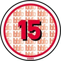
As our film contains elements of violence, crime and portrays vulnerability which may be a concern for some parents, we felt that we should include a certificate in the bottom right hand corner of the film poster, as this also establishes an audience from the off, giving an indication of the gritty and realistic content of the film. We decided to certify 'Raze' as a certificate 15 as the lead character is meant to be around the age of 16/17 and therefore this creates a cut off point, a watershed, making the film directly accesable to youths and young adults, meaning that the content can be more realistic and portray actual events that may take place in every day life for people of a similar background, as well as giving a reason as to why some youths may be forced into crime or homelessness as a way of trying to escape.
We also decided to include a website address, as with the prolifertion of the internet being as large as its ever been, and the online world of film and movies becoming more and more common, with fan sites, blogs, teaser trailers, interviews with actors etc being posted online, allowing smaller films to establish as much hype and word and mouth as those larger ones, becoming a success on the internet before the release date of the film itself, is vital. Not only does the internet allow free and widespread distribution of the film trailer through sites such as YouTube, as well as images, interviews and so on, the use of an official film website also allows a stronger fan base to be created, meaning that the target audience is established before the release date. We also included a production company title: An absent friends production, as we felt that this represented some of the cases where youths may have not returned home after trying to escape their deprived lifestyle, and also indicating that everyone needs a friend, which is a positive message that this social realist thriller can give off to youths, that they are not alone in their problems.
 With social networking also a massive influence on youth culutre in the modern Britian, this advert could not only be placed on billboards in large cities, so that its target audience are easily accesible, but this poster could also be posted online on social netwoeking sites such as facebook, as this is a site where there is a massive audience of youths, which is our primary target audience, already collected together in one place and sharing similar ideas and cultural aspects.
Overall i think that our film poster is very successful in grabbing the audience's attention and giving a taster without giving too much away about what is to come within the film itself. The image itself that we chose establishes setting and mise en scene very well, with its grimey and dirty location of the subway it creates an urbanised feel to the film as well as establishing the lonely character of Erin herself, sat alone in a subway, giving hints as to the storyline of the film. If we were to improve this film poster in any way, if we had had the technology, it would have been good to add the title of the film as graffiti text onto the wall of the subway itself to make the text and image cohesion even smoother although i feel it is very successful as it is.


