After finishing our filming and becoming happy with the shots we had
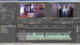
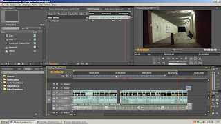
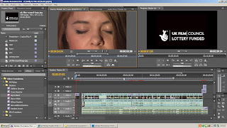
taken, we then began to edit using Adobe Premiere as opposed to Windows Movie Maker to achieve a more professional edit that is much tighter making the shots converge and flow a lot more smoothly. We first began by capturing all of our footage into Adobe premier. We then selected through all the takes of each shots to determine the 'best' shot; where the lighting, setting, acting and cut was the most professional and effective for our trailer sequence. After looking through all of our footage that we have filmed so far, across the three days of filming which took place, i feel that our trailer is conforming to the codes and conventions of the action thriller and social realist drama that we have tried to create with a gritty feel to it that is maintained throughout.
We have used locations available to us around our local town, in the more built up and deprived areas, that have similar characteristics and feels to them to those areas of inner cities where the film is meant to be set. The films that we shot at the littlemoor subway with the graffiti across the walls of a very lonely and derelict area are particularly accurate in terms of representation of lifestyle and in setting the scene and creating the correct mise-en-scene. The acting was also particularly realistic and we were very pleased with the mature way in which our friends from the college drama department as well as other art friends had approached the filming and put as much effort as possible in to create realistic fights as well as conforming to the dress codes that we had asked for. Our main character Laura gave an excellent portrayal of Erin and captured the sadness and loneliness of her brilliantly in some of the more close up shots that some young actors may have felt uncomfortable with, ensuring that our trailer is authentic in its look and feel and creating relatable and most importantly, believable characters that add to the overall coherence of the trailer. As we hadn't used Premier for nearly a year after finishing our AS coursework, we had to be recapped on the tools by a member of the media block and also learnt how to use new tools that a slightly more advanced in the effects and edits they create which i found a good experience and overall very helpful and beneficial to our editing.
We firstly arranged the 'best' take of each shots into the correct sequence of events, as we had filmed them not in sequential order. We then began cutting and removing the over filming that takes place on any shot and adding in fade in from blacks at the beginning and end of the trailer to make the edits a lot smoother using Adobe Premier. As our new A2 teacher for media studies this year has no experience in the practical side of the subject we have attended extra workshop lessons with some members of the btec media department at our college and have also relied on online tutorial on sites such as YouTube as well as trial and error method when approaching the editing process, although we have now become fairly comfortable with the program after having some experience with it last year and the new knowledge from A2.
When thinking about what music to include within our trailer we also need to think about and identify with the characters within the trailer and the audience. As Erin is a young teenager and therefore the primary audience and group of society that are most likely to watch this film due to the fact they can connect to and relate with the character are youths of a similar age to the characters. As music is a large part of contemporary youth culture in the modern day it is essential that we pick a well known gritty song that through both sound and lyrics represents the life struggles faced by Erin, so that the audience can immediately, just from the sound, identify the mood of the film. As we chose show the changes faced by a character who was both socially and economically deprived from a inner city area, we had to look at the styles of music that are popular amongst youths from these areas.
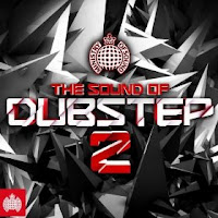
With Dub step, Drum and Bass and Grime being a very firmly established genre amongst the contemporary youth culture of Britain's cities, we thought it vital to use a piece of music from this genre, to create the correct representation and stereotype of our main character and so that the audience could easily relate to her and not feel alienated or misrepresented.
We selected a piece of music by Freestylers (Flux Pavilion remix) called Cracks taken from the new album from The Ministry of Sounds Dub step 2 album that was released 27Th of December 2010 and is therefore fairly recent and contemporary but has been out long enough for youths to have already heard the song and to be able to relate to it. The title of this song itself reflects that shift in Erin's character which takes place throughout the trailer, after she finally has enough of the depressive life that is so badly effected by both home and school. This piece of music starts fairly slow paced, which again mimics the movements of Erin at this time. As we wanted the pinnacle moment to be represented by Erin's sinister walk over and look down over a boy that had just been a victim of gang attacks and the smile that comes with it, it was important that the music changed dramatically at this point and so we moved the audio sound to fit in time with this fade to black before the quick paced fight scenes took place, ensuring that the drop into the faster and heavier beat was timed with this smile and fade out.
The lyrics themselves also created a very effective ending, where Erin lifts her hood while sat in the derelict subway to reveal a shot of only her blank face stating: "And the cracks begin to show" before the music slowly fades out, which we paired with a fade to black. Overall i think that the music piece we have chose is very effective at representing the character of the film as well as creating the correct mood and vibe for each of the shots and the two variations of Erin's character that the audience see throughout the trailer.
Once the audio had been picked and synced with the filming we then had to think about what ambient sounds and what dialogue needed to be heard above the music. We used the selection tool to drag down and up various sections and parts of both the music audio and the audio that was captured with the filming, using a fade in and out approach with both to ensure the music did not abruptly stop to make way for dialogue, as this would make the cuts too jumpy and stuttered which can be irritating for the audience and makes the edits too harsh, but did not leave the music too loud so that the dialogue was muffled or hard to distinguish from the music. We did experience a few problems when taking this on as one scene in particular, where Erin goes to attack a girl in the corridor had very low diegetic sound and therefore even when it was turned up as much as possible it was not able to be heard clearly, the other girl say "freak" so that the audience understood the motivation for the attack. Instead we decided it was best to use the music as they mood setter and the dramatic pace of the music combined with the previous shots showing Erin's spiral out of control meant the dialogue was not neccesarily needed for the scene to make sense and essentially works well as it is with little ambient and diegetic sound.
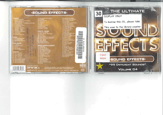
We also used a sound effects CD called 'Sound Effects: 99 different sounds, Volume 04' which we found in the CD and sound collection of our college library as we needed a smashing sound effect for when the bottles are knocked off of the kitchen unit, signifying Erins disgust and anger at her mothers drinking problems, as obviously due to health and safety we were unable to smash the bottles literally as it could have been dangerous and would have been hard to control and predict what might happen each time we took the shot. We imported the chosen sound entitled 'Window smashing' into Adobe Premiere and synced it in time with the film, lowering the audio slightly to make the smashing more prominant.
The use of fade ins back into the original volume of the added music, also allowed a way of re-entering back into the more fast paced scenes and heavier beats and drops of the music, again ensuring that the flow of the trailer was smooth and aesthetically and orally pleasing. Our final part of editing is to add credits to the film trailer, to give recognition to our actors as well as being used as a tool to fill in some fade to blacks that have been included to help the sequences run smoother. The title of the film 'Raze' will also need to be added at some point during the trailer and we need to ensure that this credit stands out much more predominantly than the others, with a larger and bolder font, to ensure that the audience are able to recognise this as the title of the film, with the trailer therefore fulfilling its purpose.

As in the codes and conventions of most film trailers from the action thriller genre, the title of the film is placed at the end of the trailer, in the final shot, usually against a plain, dark background. It is placed at the end so that the audience's attention is held and maintained throughout the entire of the trailer, as they anticipate the ending for the name of the film so they can identify it and then choose to go and watch it. The fact that they have also been made to wait for it also creates a sense of excitement and enigma which adds to the hype of the action packed film trailer they have just seen. The use of dark backgrounds and large, bolded white lettering which through the name itself gives the impression of a gritty social realist genre, makes the word more memorable and therefore gives a higher chance of being first choice next time a member of the public comes into a cinema and sees the list of names of the films available. We chose a font to use throughout our coursework for the title called 'Distorted and Scratchy' as it gives the gritty and social realist effect that we wanted and this font theme runs throughout the credits and titles as well as in the other media pieces such as the poster and the magazine cover to give coherance between the texts and allow a sense of brand to be created and reinforced throughout all areas of advertisement and promotion, as well as an immediate recognition of product.
It is important that we adhere to the codes and conventions of our chosen genre for our trailer, as this is what the audience will be expecting to see from their knowledge of action thriller film trailers and its important that they are able to connect with and relate to ours within this genre. Once we have created a rough final edit including music and credits it would be essential to do some market research and show the trailer to a number of youths (the primary audience) and parents (the secondary audience) to see their reactions to the trailer and identify any improvements that could be made before a final edit is produced.
After finishing adding the credits and titles into the appropriate places for our trailer we wanted to make them more effective and so added some video transitions and effects to the help the coherance of the trailer as a whole between shots more smooth and fluent and to also give emphasis to the words, using dip to blacks to make the words dissolve onto the screen from a blackbackground as well as a zoom transition of the text to make it come in towards the viwer as the though the title is going to jump out of the screen, again giving this idea of a brand and emphasis of the title name, which is an important aspect is selling the film itself.


