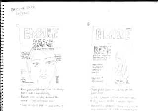
For the magazine cover we plan to use an image of Erin, the lead character staring blankly into the camera while sat in the subway which becomes her sleeping place after she flees home and runs away from school, which is also the last shot that the audience will see within the trailer before the title of the film 'Raze' appears across the dark screen. This will therefore be using the final and most memorable image from the trailer as a way of advertisement for the film within the magazine, but also creating a relatable image that is accurately representative of the character that is shown in the film trailer, and allowing the public to make a connection between the two mediums.
 We will be using the magazine cover template from a well known film review magazine, like Empire and Total Film, for our film trailer magazine cover so that it is a well known and firmly established magazine within the public and therefore already has a well established and witheld and easily accesable audience for our product to be realeased and advertised
  to. As film and television is also a very large part of contemporary culture, this also means that the magazine is likely to have a consumer age of a similar age to our primary audience (young adults and teenagers) meaning that this would be the ideal platform to advertise our film on, as these magazines already have a large fan base of these ages. We will also be creating an accompanying Film Poster to advertise and promote the release of our film.
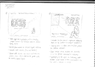
As we wanted to keep a theme running throughout both mediums to draw direct emphasis onto the main character, Erin, as she is the most significant, with the film being a portrayal and social realist piece about her every day life. It's vital that she is included in both the magazine cover image and the image used for the Fim Poster to allow the audience to make connections between the three mediums of film, magazine and poster so that they subconsciously apply the title Raze to all and therefore have an immediate understanding of the storyline, genre and stereotypes used within the film from these images that accurately represent the character that is potrayed in the film itself.

For the image used for the Film Poster we will be using the same location of the subway, as this is an iconic location that is assocaited with inner city areas and particularly crime and youth crime in terms of graffiti and violence attacks, according to the British media, and this will therefore represent her social position and her situation very well, as many subways become of the home of the homeless or those sheltering from the weather. We plan to use an image of the empty subway with her standing leaning against the graffitied wall, looking down through the subway, emphasising her loneliness and the vulnerability of her situation.
In both images Erins character will be dressed in old and plain clothing, like she was asked to wear throughout the filming, to keep the dress codes consistent and maintain the stereotype and mise-en-scene of the inner city povertised area that she is meant to be from which is both socially and economically deprived due to the over crowding and lack of work/qualifications.
LINK TO POSTER SKETCH AND MAGAZINE SKETCH.
No comments:
Post a Comment