Any use of music in this trailer complies with 'Fair Dealing' under the 1988 Copyright Designs and Patents Act (UK), Sections 6(i) and 6(ii); Fair dealing is a term used to describe some limited activities that are allowed without infringing copyright. Briefly these are as follows: Section 6i: Research and private study. Copying parts of a literary, dramatic, musical or artistic work or of a typographical arrangement of a published edition for the purpose of research or private study is allowed under the following conditions: The copy is made for the purposes of research or private study; The copy is made for non-commercial purposes; The source of the material is acknowledged; The person making the copy does not make copies of the material available for a number of people.
Here is the finished product of our film trailer for the our social realist thriller 'Raze' which has been edited and exported using Adobe Premiere CS4 and then uploaded to our group YouTube account entitled 'RazeFilm'
This film trailer features 2 minutes and 28 seconds of the audio soundtrack Cracks by Flux Pavillion (Freestylers Remix) as well as the Optimum Releasing Ident and UK Film council lottery funded logo.
Evaluation:
In what ways does your media products use, develop or challenge forms and conventions of real media products?
As many of the film trailers from the social realist thriller genre that I looked at during my research, contained male lead characters, we wanted to challenge this code and convention by using a female lead character to play the role of the protagonist. As to ensure that we didn’t stray too far from these existing codes and conventions, and represent either sex in a negative way, we wanted to show a shift in character, to show the change a youth may be forced to take if life struggles become too much to cope with. Of course I didn’t want to portray violence or aggression as a solution to problems, but merely suggest a story and some reason as to why so many youths from socially and economically deprived backgrounds may find themselves in these vulnerable situations.
We showed the shift between Erin’s character with the witnessing of a gang attack on a young male and the symbolic representation of her cutting off her hair signified the change in her character to a more dominant, antagonistic and aggressive Erin that tried to take control of her mother’s alcoholism, the bullying at school, which unfortunately spirals the wrong way out of control leading her into threatening a teacher and becoming homeless, alone and even more vulnerable.
The film challenges the common withheld stereotype of ‘hoodies’ and ‘chavs’ and the antisocial behaviour of these social groups that many people brand all youths as adopting. This films purpose was to show the vulnerable side of these youths, which ultimately are children, an image of these people that many people fail to see due to the mediated version of events the press and television gives off surrounding inner city youth culture. We wanted to ensure an audience connection was made, which is one of the main aspects of the genre of social realism, so that the audience could relate to Erin and her life and empathise with the events that she goes through throughout the film and bring to light issues of violence, neglect and bullying that many people may face in their own lives.
I hope that this film, through its gritty, realistic and stripped back approach will help people to see the vulnerability and the turbulent home life that many youths face on an everyday basis and help people to change the ideologies and the mediated fear surrounding youth culture that has created a generation gap, due to misinformation and lack of understanding, as many of these youths feel alienated and even more alone due to the negative way in which they are perceived, creating a vicious cycle as many then believe that turning to crime is what they are expected to do to survive. I hope that through this film we will be able to challenge, if not change these ideologies, and help reconnect the youths of today with the rest of society.
How effective is the combination of your main product and ancillary texts & have you created a brand?
The coherence of our film trailer, magazine cover sleeve and film poster, overall, is very smooth with ideas, as well as graphological and typographical coherence taking place throughout, helping to create a specific product brand. The use of the same font face of ‘Distorted and Scratchy’ throughout all three medium helps to create this brand and also gives a relatable key aspect to all of the media texts allowing the audience to immediately identify with the product when seeing any of the products of promotion and advertisement.
As setting the scene for the narrative and giving an accurate representation of ideologies and a feel for what the narrative of the film will be about, as well as, of course, firmly establishing genre, is vital in ensuring these media texts fulfil their purpose it was crucial we thought every image out before deciding on the final ones to use for the magazine cover and film poster, as we wanted it to merge with the film trailer as best as possible. As the final scene of the film trailer shows Erin sat alone in the underground subway looking up into the camera with her hood up, this being the first time she really connects with the camera and subsequently the audience, right before the title of the film appears, we thought that this would be a perfect shot to use for the magazine cover as it allows the character to be relatable and this is also the most memorable scene of the trailer as its the final image that is left with the audience before it ends.
Throughout the film trailer we can establish setting through the mise en scene, creating an urbanised feel to the location from the inclusion of police sirens, grimey parks and most importantly the derelict and graffiti ridden subway, that again is shown in the final shots of the film, reinforcing this urban feel to the film and also establishing the characters social class background which is also reinforced through the dress codes. This use of the subway also sets the mood and feels to the whole narrative, as it’s dirty, gritty and grim, much like the plot and storyline that is faced by Erin, and leads her to take such drastic measures in her life.
To link the texts as closely as possible we used this subway location for the photo shoot for both the magazine cover and the film poster, so that a setting can immediately be established from the poster and magazine cover by the audience, meaning that when they go to watch the trailer, they will already have a feel for the age and background of the character and be able to relate it to their own lives, as I think that the texts show off very well that this film depicts the real life struggles of a youth and therefore is most relatable to for youths.
What have you learned from your audience feedback?
From my audience feedback I was delighted to learn that they thought that the music and audio that we chose to use fitted perfectly with the narrative and social realist genre of the film trailer. Both the beat and climax of the audio piece which was a drum and bass song, a genre very popular in the contemporary music culture , especially amongst the youths of the inner city areas, called ‘Cracks’ by Flux Pavillion (Freestylers Remix). This allows the primary target audience an immediately recognisable link to their own youth culture, gripping them from the first shot of the trailer.
The title of the song in itself represents perfectly the way in which everything becomes too much for Erin’s character and she feels a need to break free, change and escape causing her to snap or in many ways 'crack' herself. The beat of the song a long with the climax up to the drop of the beat also fitted perfectly with the shift in character with it building up as Erin walked towards the boy lying on the floor and then began smiling, signifying her change. I think if we were to improve our film in any way it would be through more trial and error with more advanced editing software and technologies to create more spectacular effects, although due to the grittiness and social realism that we wanted to create I think that a more simplistic approach makes it feel more realistic and look more believable, as it shows Erin stripped bare, exactly as she is.
Our audience feedback also suggested that we established a stereotype for the character well and maintained it throughout the film trailer, and other media texts which I think was made possible by the fact that we had a very clear set out narrative and storyline and both me and my partner holly, had a very specific way in which we wanted her character to be portrayed, as we wanted the emphasis to be on the shift in character and the problems she faced in everyday life, but also to focus directly on the loneliness and vulnerability of her character due to the negative home life she has experienced from an early age. There was also very positive comments surrounding the acting of the protagonist Erin, as well as accompanying actors, as we wanted to create a realistic and authentic product as possible, sticking closely to the codes and conventions used surrounding both framing of shots, editing transitions and effects as well as creating and maintaining a narrative throughout, and ensuring appropriate titles were used to fit with the genre and in time with the music and shot sequence, using typical features that we had adopted and analysed from our own research of trailers from the genre.
I think that we managed to create a build up of of narrative throughout the trailer, with the shots becoming more action filled and intense in correlation with the climax of the music, which was a feature we had noticed throughout many of our style models and research on trailers from the genre, creating suspense leading to the final scene where the actor finally connects with the audience, before leaving the final scene of the film title which itself is catchy and thought provoking, which ultimately is what social realism seeks to achieve. Overall i think that our film trailer was such a success due to the fact that we had a shared idea, and well thought out plan of what we wanted to achieve and how we wanted it to look in terms of editing and representation of the characters, meaning that we experienced little, if any, disagreement, making the whole process enjoyable and allowing us to focus directly on what we were trying to achieve.
This social realist genre, where one character, or a group of characters lives takes centre stage of the entire film was also conformed to through the use of our filming shots and angles. A number of people commented that they liked the point of view shots and the use of lots of close up shots of Erin as it allows the audience deeper into the story, to become absorbed in it, and also to gain a deeper and more empathetic understanding of the protagonist.
How did you use media technologies in the construction and research, planning and evaluation stages?
The use of media technologies was vital throughout all aspects of production in ensuring an authentic and professional final film trailer and accompanying magazine cover and film poster. Throughout the planning stages I used the Internet a vast amount in researching films, the codes and conventions found within both social realist films and thriller to see what parallels there were and what differences and found that in both cases the lead character was usually male and therefore wanted to challenge this code and convention not only to create a more generally equal genre but also to do something new and exciting as, with a media that changes so frequently and drastically its vital that an element of contemporary is withheld and maintained to achieve.
The use of blogs for posting my work, essays and analysis has also allowed me and my partner in production, Holly, to communicate outside of lessons and share ideas in a more open and frequent way. One of the most important aspects of media technology that has enabled us to create and distribute this film is the Web 2.0 and the introduction of file compression. This allows large film files, such as our ‘Raze’ trailer, to be uploaded quickly and easily to a file sharing site such as YouTube which has a mass fan base, spanning across the globe at the click of a button, as well as giving us, as producers an easily accessible target audience with easy and ample opportunity to receive direct audience feedback not only from YouTube but also through social networking sites like Facebook which allows people to comment and give feedback quickly and easily. This in itself has opened up opportunities for everyone allowing anyone to theoretically become a producer.
Another vital aspect of media technology is the Adobe Premiere CS4 editing software as well as Adobe Photoshop Cs3 which has allowed us to edit together, construct and be experimental with our own film and effects to create an individualistic product that adheres to common codes and conventions of real life mass produced film trailers, as well as enabling us to create authentic looking and professional posters and magazine covers which advertise and promote our product in a authentic way and ensure that the audience are gripped at first glance, and eager to find out more. As filming technology itself is also now so widely available, with most compact cameras now having a film and video mode built in; this has created spontaneity amongst the film industry as well as allowing more creative and expressive genres to form giving the power of production to the audience itself.
Overall I am really impressed and proud of the overall outcome of all of my media productions. I feel that we have established an easily recognisable brand for the film Raze, which captures the social background, genre, urban location and setting and the gritty realistic nature of the social realist thriller theme perfectly throughout the film trailer and ancillary texts. The character that we have created is relatable to by our primary audience of youths and young adults, and challenges the stereotype and negative image that is created by the mediated press across our society, giving a counter side to the story as to why some young teens may lead a life of loneliness or feel the need to turn to violence as a way of survival. I feel that we have been able to produce these media products to such a good standard due to the fact that we were so thorough and thought out in our planning and research and ensured that we knew exactly what we wanted to achieve before we set out to produce it.
I feel that the area we could improve on most would be using even more advanced editing software to be more bold and daring with our edits and to also enable us to create more complex sequences of shots, although I feel that we have used the software available to us, Adobe Premiere Pro CS4, to its full potential and maybe trying to make the speech of some of the shots clearer, through the use of larger and more complex microphones to make the editing process easier, as we did have to alter the sound levels of some of the scenes and then merge it through across the others to make sure the film flowed smoothly and coherently.
Tuesday, 3 May 2011
Thursday, 28 April 2011
Film Poster
 Here is the link to my RAZE FILM POSTER
To ensure that a product brand was established we used the same location for the setting of our film poster of the image used in the Empire magazine cover as well as the same font 'Distorted and Scratchy'. We also wanted to convey the narrative of the film, a long with the mood and atmosphere of the film, conveying Erin's lonely and troubled lifestyle created by the problems at home and school, leading her to turn to violence and aggression as her only way of self expression which penultimately leads to her becoming even lonelier living on the streets of the inner city she calls home.
 We placed the model to the right of the image, as the eye is immediately drawn to the top left hand corner of an image, due to the fact in English we read from left to right, therefore by placing the title of the film in the most important part of the overall image it makes it more memorable and the first thing that the eye is drawn to. As the image used for the magazine cover was very connective, with the actor looking directly into the camera, we wanted a counter image, which emphasised the inner city location of the film, so that the audience are able to establish an idea of the area that the lead character is from, as well as ensuring that the target audience can also associate their own lives with the film, making it relatable.
We got the actor to wear the hoody that she wears in the last shot of the film trailer where she lifts her head up to look into the camera and places her black hood over her head however took this image from a side on view of this shot, again creating texts and film that have coherance and an established image and brand. The dark figure of the actor is seen as being alone against the vast empty grimey subway that she has been forced to take refuge in, again emphasising her loneliness and the vulnerability many youths in these areas may face, also setting the scene and creating a mood and general mise en scene for the whole film.
 We chose to use the subway for this photo shoot location as it establishes a setting and stereotype immediately, as well as the use of dark clothing and the use of dress codes including a 'hoody' which is stereotyped as the media as being associated with economically and socially deprived youths of inner city areas, many of which receive bad press and unfair titles for the way in which they may have to lead their everyday lives to survive. The graffiti and the grimey and run down look of the subway adds to the mise en scene of the film and firmly establishes a setting as well as some traits of the lead character, as we can immediately recognise the inner city and lower class background that she is from.
 We included the logos of both of the British companies that we had selected to act in partnership with our film, including Optimum releasing for distribution, as they are a well known British firm across the UK, who specialize in British films about our culture and way of life, as well as The UK lottery funding council, who contribute funding and enable many of these culturally British films to be created and become successful, and so we felt that these two companies in particular were most coherent with our own product.
As many film posters that we looked at during research also included a promotional rating or quote from a welle stablished film review magazine, we included a quote from Empire Magazine to fit in with our own product that we had created as part of our coursework, creating parallels between the two products, both stating 'British Thriller' showing a coherance between media texts as well as establishing a firm brand with the same font style for the title being used throughout the filmt railer, magazine cover and the poster.
As our film contains elements of violence, crime and portrays vulnerability which may be a concern for some parents, we felt that we should include a certificate in the bottom right hand corner of the film poster, as this also establishes an audience from the off, giving an indication of the gritty and realistic content of the film. We decided to certify 'Raze' as a certificate 15 as the lead character is meant to be around the age of 16/17 and therefore this creates a cut off point, a watershed, making the film directly accesable to youths and young adults, meaning that the content can be more realistic and portray actual events that may take place in every day life for people of a similar background, as well as giving a reason as to why some youths may be forced into crime or homelessness as a way of trying to escape.
We also decided to include a website address, as with the prolifertion of the internet being as large as its ever been, and the online world of film and movies becoming more and more common, with fan sites, blogs, teaser trailers, interviews with actors etc being posted online, allowing smaller films to establish as much hype and word and mouth as those larger ones, becoming a success on the internet before the release date of the film itself, is vital. Not only does the internet allow free and widespread distribution of the film trailer through sites such as YouTube, as well as images, interviews and so on, the use of an official film website also allows a stronger fan base to be created, meaning that the target audience is established before the release date. We also included a production company title: An absent friends production, as we felt that this represented some of the cases where youths may have not returned home after trying to escape their deprived lifestyle, and also indicating that everyone needs a friend, which is a positive message that this social realist thriller can give off to youths, that they are not alone in their problems.
 With social networking also a massive influence on youth culutre in the modern Britian, this advert could not only be placed on billboards in large cities, so that its target audience are easily accesible, but this poster could also be posted online on social netwoeking sites such as facebook, as this is a site where there is a massive audience of youths, which is our primary target audience, already collected together in one place and sharing similar ideas and cultural aspects.
Overall i think that our film poster is very successful in grabbing the audience's attention and giving a taster without giving too much away about what is to come within the film itself. The image itself that we chose establishes setting and mise en scene very well, with its grimey and dirty location of the subway it creates an urbanised feel to the film as well as establishing the lonely character of Erin herself, sat alone in a subway, giving hints as to the storyline of the film. If we were to improve this film poster in any way, if we had had the technology, it would have been good to add the title of the film as graffiti text onto the wall of the subway itself to make the text and image cohesion even smoother although i feel it is very successful as it is.
Tuesday, 26 April 2011
Magazine Cover
EMPIRE MAGAZINE COVER FOR 'RAZE' FILM TRAILER:
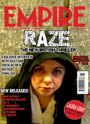 This is the magazine cover that we have created using the template model from the well known and firmly established film review magazine 'Empire'. As we wanted to conform to the codes and conventions of a recognisable brand we used the same colour theme of red and white for the text that was added to the image that we took in our own photoshoot with the lead character at the subway location which features in the final shots of our trailer, specifically the last shot, and most close up and personal shot of Erin that we see throughout the sequence of shots, therefore making it more memorable and effective to use for other advertisements and promotional aspects of the film.
 The subway also establishes the social realist aspect of the genre of our film very well, creating a stereotype of an inner city area and therefore immediately establishing our primary audience of youths of a similar age that can relate to the character.

The image itself that we used for the background of the magazine cover was a close up shot of Erins face replicating the final scene of the trailer. We wanted the image to be gritty and connective and so got the model and lead character to look directly into the camera itself, as the eyes are the most connective aspect of the body and portray emotion and mood perfectly. Through Laura's eyes you can see the loneliness of her character and the poverty of the world that she lives in. The fact that her hood is up also connotes the stereotype of 'hoody' youths and this agressive and dominant traits that the media has assigned to many youths living in more economically deprived areas of the cities of the UK. This emotion that is created through her eyes combined with the stereotype of the 'hoody' however makes her appear very vulnerable and unhappy as opposed to someone that the public should fear which was the message we were trying to get across, showing that some youths fall into this way of life, not by choice but by the fact it is the only way to survive or try and escape the lives they already lead.
In creating the magazine cover itself we used Adobe Photoshop CS3 for Apple Macs and uploaded the image into the program before cropping the image to make her eyes the central point of the image and therefore the focal point, leaving enough space at the top of the image for the font and title of 'Empire' the well established brand that will be the bait for creating an audience, who are alrady avid and loyal readers of 'Empire' film review magazine which has many large titles take front cover of its magazine across the months.
We then cut, copied and pasted a bar code from an exisitng magazine cover that we had looked at in research to ensure that the magazine cover looked authentic as possbile and placed it in the same place. We found that there was quite a lot of extra text and information about the content of the magazine on many of our research magazines and so thought carefully about what could go on the front cover including upcoming films from a similar genre, or with a famous and well known title and background or actors.
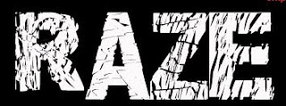 We then created our own font face for the title of our film 'Raze' using a downloaded front through Adobe Photoshop entitled "Distorted and Scracthy" as the word Raze itself connotes a very sliced up and destructive image, the graphological and lexical cohesion works brilliantly in reinforcing the genre of a gritty and stripped bare film looking at the every day life struggles of a young girl from a socially and economically deprived background.
We used a circular pin attacthed over the bottom of the image using Photoshop to include the models name and suggest that she is an "up and coming star of 2011" giving the film status as for such a well established magazine like Empire to give a title like that will mean that the audience and readership are more likely to accept the ideology and accept the idea. We also wanted to reinforce this idea of how we were looking at British culture specifically and as this magazine is also available in the United States we wanted British people to feel a sense of collective identity when seeing this film. Many youths, being the primary audience, of a similar age and background to the lead character Erin may be facing home and money troubles of their own and therefore allows this to be seen as normal as opposed to something to be ashamed of, or needing to lead to drastic measures.
We wanted to show what can happen, giving a reason as to why some youths may go into crime and homelessness as a way of escaping their home life, giving a reason as to why this stereotype may be rising among young people, although the media press surrounding it is usually very negative, not looking at the vulnerability of these youths and the loneliness they may feel. For this reason we used the tag line " THE NEW BRITISH THRILLER", allowing an immediate recognisation and connectability with the British public as we have a quite a strong sense of nationalism within our country, therefore establishing the basis of our audience, then specficically targeting youths and young adults in terms of the content, characters and narrative.
Overall i am very pleased with the outcome of our magazine cover as it looks authentic and conforms to the common codes and conventions used within Empire Magazine Covers that i have looked at for research, although there are a few areas that we could improve on. The image itself is slightly out of focus although this can add to the images effect, as it reinforces the gritty nature of the film and also shows that the real Erin is not completely visible to the audience, as he hides behind her front of voilence.
When trying to take the Empire logo and place it onto our own image we also experienced problems with pixellation due to copyrighting, and this was the best that we could achieve with only a minor pixellation on a few letters. The typography that we chose to use for our own title of the film, Raze, captures the mood and narrative of the film perfectly, entitled 'Distorted and Scratchy' which is used throughout our brand, gives the words themselves a rough and raw texture to them which also represents the word Raze, meaning destruction, accurately and keeping the theme of the brand.
Raze Magazine Cover
 This is the magazine cover that we have created using the template model from the well known and firmly established film review magazine 'Empire'. As we wanted to conform to the codes and conventions of a recognisable brand we used the same colour theme of red and white for the text that was added to the image that we took in our own photoshoot with the lead character at the subway location which features in the final shots of our trailer, specifically the last shot, and most close up and personal shot of Erin that we see throughout the sequence of shots, therefore making it more memorable and effective to use for other advertisements and promotional aspects of the film.
 The subway also establishes the social realist aspect of the genre of our film very well, creating a stereotype of an inner city area and therefore immediately establishing our primary audience of youths of a similar age that can relate to the character.
We used the exact font used within the 'Empire' logo to make the magazine cover look authentic and stuck to a close template that we had found from research to make it appear as realistic as possible.

The image itself that we used for the background of the magazine cover was a close up shot of Erins face replicating the final scene of the trailer. We wanted the image to be gritty and connective and so got the model and lead character to look directly into the camera itself, as the eyes are the most connective aspect of the body and portray emotion and mood perfectly. Through Laura's eyes you can see the loneliness of her character and the poverty of the world that she lives in. The fact that her hood is up also connotes the stereotype of 'hoody' youths and this agressive and dominant traits that the media has assigned to many youths living in more economically deprived areas of the cities of the UK. This emotion that is created through her eyes combined with the stereotype of the 'hoody' however makes her appear very vulnerable and unhappy as opposed to someone that the public should fear which was the message we were trying to get across, showing that some youths fall into this way of life, not by choice but by the fact it is the only way to survive or try and escape the lives they already lead.
In creating the magazine cover itself we used Adobe Photoshop CS3 for Apple Macs and uploaded the image into the program before cropping the image to make her eyes the central point of the image and therefore the focal point, leaving enough space at the top of the image for the font and title of 'Empire' the well established brand that will be the bait for creating an audience, who are alrady avid and loyal readers of 'Empire' film review magazine which has many large titles take front cover of its magazine across the months.
We then cut, copied and pasted a bar code from an exisitng magazine cover that we had looked at in research to ensure that the magazine cover looked authentic as possbile and placed it in the same place. We found that there was quite a lot of extra text and information about the content of the magazine on many of our research magazines and so thought carefully about what could go on the front cover including upcoming films from a similar genre, or with a famous and well known title and background or actors.
 We then created our own font face for the title of our film 'Raze' using a downloaded front through Adobe Photoshop entitled "Distorted and Scracthy" as the word Raze itself connotes a very sliced up and destructive image, the graphological and lexical cohesion works brilliantly in reinforcing the genre of a gritty and stripped bare film looking at the every day life struggles of a young girl from a socially and economically deprived background.
We used a circular pin attacthed over the bottom of the image using Photoshop to include the models name and suggest that she is an "up and coming star of 2011" giving the film status as for such a well established magazine like Empire to give a title like that will mean that the audience and readership are more likely to accept the ideology and accept the idea. We also wanted to reinforce this idea of how we were looking at British culture specifically and as this magazine is also available in the United States we wanted British people to feel a sense of collective identity when seeing this film. Many youths, being the primary audience, of a similar age and background to the lead character Erin may be facing home and money troubles of their own and therefore allows this to be seen as normal as opposed to something to be ashamed of, or needing to lead to drastic measures.
We wanted to show what can happen, giving a reason as to why some youths may go into crime and homelessness as a way of escaping their home life, giving a reason as to why this stereotype may be rising among young people, although the media press surrounding it is usually very negative, not looking at the vulnerability of these youths and the loneliness they may feel. For this reason we used the tag line " THE NEW BRITISH THRILLER", allowing an immediate recognisation and connectability with the British public as we have a quite a strong sense of nationalism within our country, therefore establishing the basis of our audience, then specficically targeting youths and young adults in terms of the content, characters and narrative.
Overall i am very pleased with the outcome of our magazine cover as it looks authentic and conforms to the common codes and conventions used within Empire Magazine Covers that i have looked at for research, although there are a few areas that we could improve on. The image itself is slightly out of focus although this can add to the images effect, as it reinforces the gritty nature of the film and also shows that the real Erin is not completely visible to the audience, as he hides behind her front of voilence.
When trying to take the Empire logo and place it onto our own image we also experienced problems with pixellation due to copyrighting, and this was the best that we could achieve with only a minor pixellation on a few letters. The typography that we chose to use for our own title of the film, Raze, captures the mood and narrative of the film perfectly, entitled 'Distorted and Scratchy' which is used throughout our brand, gives the words themselves a rough and raw texture to them which also represents the word Raze, meaning destruction, accurately and keeping the theme of the brand.
Raze Magazine Cover
Tuesday, 29 March 2011
Magazine Cover & Poster Planning for Raze
As the main focuses of our thriller/social realist drama are both to expose an explanation as to why some young teens may be forced into crime and violence as a way of surviving and getting themselves heard. Our story followsthe every day struggles of a young adolescent female, challenging the common stereotype that "all youths are violent hoodies" which is so strongly reinforced by the UK press, especially giving young males a bad name. We also wanted to challenge the common code and convetion used within the genre, that males are used as lead characters, as shown from research in Kidulthood and Adulthood, as we wanted the genre to become more equal and to appeal to a wider and more gender equal audience, as well as showing that in some cases young females may also be driven to drastic measures as a way of trying to escape the horrors of their lives. For these reasons we want the image used for our magazine cover and for our poster to be bold and connective to the audience, and as the eyes are the most connectable aspect of a person, these will be the focal point of the images used.
For the magazine cover we plan to use an image of Erin, the lead character staring blankly into the camera while sat in the subway which becomes her sleeping place after she flees home and runs away from school, which is also the last shot that the audience will see within the trailer before the title of the film 'Raze' appears across the dark screen. This will therefore be using the final and most memorable image from the trailer as a way of advertisement for the film within the magazine, but also creating a relatable image that is accurately representative of the character that is shown in the film trailer, and allowing the public to make a connection between the two mediums.
 We will be using the magazine cover template from a well known film review magazine, like Empire and Total Film, for our film trailer magazine cover so that it is a well known and firmly established magazine within the public and therefore already has a well established and witheld and easily accesable audience for our product to be realeased and advertised
  to. As film and television is also a very large part of contemporary culture, this also means that the magazine is likely to have a consumer age of a similar age to our primary audience (young adults and teenagers) meaning that this would be the ideal platform to advertise our film on, as these magazines already have a large fan base of these ages. We will also be creating an accompanying Film Poster to advertise and promote the release of our film.
As we wanted to keep a theme running throughout both mediums to draw direct emphasis onto the main character, Erin, as she is the most significant, with the film being a portrayal and social realist piece about her every day life. It's vital that she is included in both the magazine cover image and the image used for the Fim Poster to allow the audience to make connections between the three mediums of film, magazine and poster so that they subconsciously apply the title Raze to all and therefore have an immediate understanding of the storyline, genre and stereotypes used within the film from these images that accurately represent the character that is potrayed in the film itself.
For the image used for the Film Poster we will be using the same location of the subway, as this is an iconic location that is assocaited with inner city areas and particularly crime and youth crime in terms of graffiti and violence attacks, according to the British media, and this will therefore represent her social position and her situation very well, as many subways become of the home of the homeless or those sheltering from the weather. We plan to use an image of the empty subway with her standing leaning against the graffitied wall, looking down through the subway, emphasising her loneliness and the vulnerability of her situation.
In both images Erins character will be dressed in old and plain clothing, like she was asked to wear throughout the filming, to keep the dress codes consistent and maintain the stereotype and mise-en-scene of the inner city povertised area that she is meant to be from which is both socially and economically deprived due to the over crowding and lack of work/qualifications.
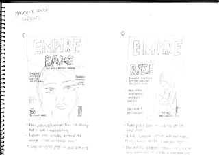
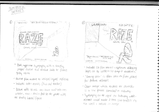
LINK TO POSTER SKETCH AND MAGAZINE SKETCH.

For the magazine cover we plan to use an image of Erin, the lead character staring blankly into the camera while sat in the subway which becomes her sleeping place after she flees home and runs away from school, which is also the last shot that the audience will see within the trailer before the title of the film 'Raze' appears across the dark screen. This will therefore be using the final and most memorable image from the trailer as a way of advertisement for the film within the magazine, but also creating a relatable image that is accurately representative of the character that is shown in the film trailer, and allowing the public to make a connection between the two mediums.
As we wanted to keep a theme running throughout both mediums to draw direct emphasis onto the main character, Erin, as she is the most significant, with the film being a portrayal and social realist piece about her every day life. It's vital that she is included in both the magazine cover image and the image used for the Fim Poster to allow the audience to make connections between the three mediums of film, magazine and poster so that they subconsciously apply the title Raze to all and therefore have an immediate understanding of the storyline, genre and stereotypes used within the film from these images that accurately represent the character that is potrayed in the film itself.

For the image used for the Film Poster we will be using the same location of the subway, as this is an iconic location that is assocaited with inner city areas and particularly crime and youth crime in terms of graffiti and violence attacks, according to the British media, and this will therefore represent her social position and her situation very well, as many subways become of the home of the homeless or those sheltering from the weather. We plan to use an image of the empty subway with her standing leaning against the graffitied wall, looking down through the subway, emphasising her loneliness and the vulnerability of her situation.
In both images Erins character will be dressed in old and plain clothing, like she was asked to wear throughout the filming, to keep the dress codes consistent and maintain the stereotype and mise-en-scene of the inner city povertised area that she is meant to be from which is both socially and economically deprived due to the over crowding and lack of work/qualifications.
LINK TO POSTER SKETCH AND MAGAZINE SKETCH.
Monday, 28 March 2011
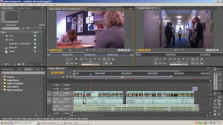
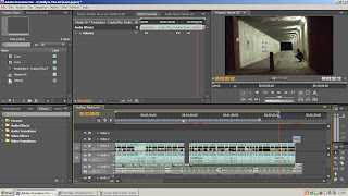
The Editing Process
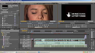
After finishing our filming and becoming happy with the shots we had  taken, we then began to edit using Adobe Premiere as opposed to Windows Movie Maker to achieve a more professional edit that is much tighter making the shots converge and flow a lot more smoothly. We first began by capturing all of our footage into Adobe premier. We then selected through all the takes of each shots to determine the 'best' shot; where the lighting, setting, acting and cut was the most professional and effective for our trailer sequence. After looking through all of our footage that we have filmed so far, across the three days of filming which took place, i feel that our trailer is conforming to the codes and conventions of the action thriller and social realist drama that we have tried to create with a gritty feel to it that is maintained throughout.
We have used locations available to us around our local town, in the more built up and deprived areas, that have similar characteristics and feels to them to those areas of inner cities where the film is meant to be set. The films that we shot at the littlemoor subway with the graffiti across the walls of a very lonely and derelict area are particularly accurate in terms of representation of lifestyle and in setting the scene and creating the correct mise-en-scene. The acting was also particularly realistic and we were very pleased with the mature way in which our friends from the college drama department as well as other art friends had approached the filming and put as much effort as possible in to create realistic fights as well as conforming to the dress codes that we had asked for. Our main character Laura gave an excellent portrayal of Erin and captured the sadness and loneliness of her brilliantly in some of the more close up shots that some young actors may have felt uncomfortable with, ensuring that our trailer is authentic in its look and feel and creating relatable and most importantly, believable characters that add to the overall coherence of the trailer. As we hadn't used Premier for nearly a year after finishing our AS coursework, we had to be recapped on the tools by a member of the media block and also learnt how to use new tools that a slightly more advanced in the effects and edits they create which i found a good experience and overall very helpful and beneficial to our editing.
We firstly arranged the 'best' take of each shots into the correct sequence of events, as we had filmed them not in sequential order. We then began cutting and removing the over filming that takes place on any shot and adding in fade in from blacks at the beginning and end of the trailer to make the edits a lot smoother using Adobe Premier. As our new A2 teacher for media studies this year has no experience in the practical side of the subject we have attended extra workshop lessons with some members of the btec media department at our college and have also relied on online tutorial on sites such as YouTube as well as trial and error method when approaching the editing process, although we have now become fairly comfortable with the program after having some experience with it last year and the new knowledge from A2.
When thinking about what music to include within our trailer we also need to think about and identify with the characters within the trailer and the audience. As Erin is a young teenager and therefore the primary audience and group of society that are most likely to watch this film due to the fact they can connect to and relate with the character are youths of a similar age to the characters. As music is a large part of contemporary youth culture in the modern day it is essential that we pick a well known gritty song that through both sound and lyrics represents the life struggles faced by Erin, so that the audience can immediately, just from the sound, identify the mood of the film. As we chose show the changes faced by a character who was both socially and economically deprived from a inner city area, we had to look at the styles of music that are popular amongst youths from these areas.
With Dub step, Drum and Bass and Grime being a very firmly established genre amongst the contemporary youth culture of Britain's cities, we thought it vital to use a piece of music from this genre, to create the correct representation and stereotype of our main character and so that the audience could easily relate to her and not feel alienated or misrepresented.
 We selected a piece of music by Freestylers (Flux Pavilion remix) called Cracks taken from the new album from The Ministry of Sounds Dub step 2 album that was released 27Th of December 2010 and is therefore fairly recent and contemporary but has been out long enough for youths to have already heard the song and to be able to relate to it. The title of this song itself reflects that shift in Erin's character which takes place throughout the trailer, after she finally has enough of the depressive life that is so badly effected by both home and school. This piece of music starts fairly slow paced, which again mimics the movements of Erin at this time. As we wanted the pinnacle moment to be represented by Erin's sinister walk over and look down over a boy that had just been a victim of gang attacks and the smile that comes with it, it was important that the music changed dramatically at this point and so we moved the audio sound to fit in time with this fade to black before the quick paced fight scenes took place, ensuring that the drop into the faster and heavier beat was timed with this smile and fade out.
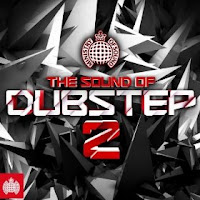
The lyrics themselves also created a very effective ending, where Erin lifts her hood while sat in the derelict subway to reveal a shot of only her blank face stating: "And the cracks begin to show" before the music slowly fades out, which we paired with a fade to black. Overall i think that the music piece we have chose is very effective at representing the character of the film as well as creating the correct mood and vibe for each of the shots and the two variations of Erin's character that the audience see throughout the trailer.
Once the audio had been picked and synced with the filming we then had to think about what ambient sounds and what dialogue needed to be heard above the music. We used the selection tool to drag down and up various sections and parts of both the music audio and the audio that was captured with the filming, using a fade in and out approach with both to ensure the music did not abruptly stop to make way for dialogue, as this would make the cuts too jumpy and stuttered which can be irritating for the audience and makes the edits too harsh, but did not leave the music too loud so that the dialogue was muffled or hard to distinguish from the music. We did experience a few problems when taking this on as one scene in particular, where Erin goes to attack a girl in the corridor had very low diegetic sound and therefore even when it was turned up as much as possible it was not able to be heard clearly, the other girl say "freak" so that the audience understood the motivation for the attack. Instead we decided it was best to use the music as they mood setter and the dramatic pace of the music combined with the previous shots showing Erin's spiral out of control meant the dialogue was not neccesarily needed for the scene to make sense and essentially works well as it is with little ambient and diegetic sound.
We also used a sound effects CD called 'Sound Effects: 99 different sounds, Volume 04' which we found in the CD and sound collection of our college library as we needed a smashing sound effect for when the bottles are knocked off of the kitchen unit, signifying Erins disgust and anger at her mothers drinking problems, as obviously due to health and safety we were unable to smash the bottles literally as it could have been dangerous and would have been hard to control and predict what might happen each time we took the shot. We imported the chosen sound entitled 'Window smashing' into Adobe Premiere and synced it in time with the film, lowering the audio slightly to make the smashing more prominant.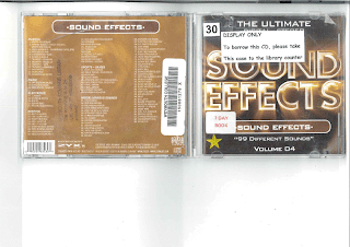
 taken, we then began to edit using Adobe Premiere as opposed to Windows Movie Maker to achieve a more professional edit that is much tighter making the shots converge and flow a lot more smoothly. We first began by capturing all of our footage into Adobe premier. We then selected through all the takes of each shots to determine the 'best' shot; where the lighting, setting, acting and cut was the most professional and effective for our trailer sequence. After looking through all of our footage that we have filmed so far, across the three days of filming which took place, i feel that our trailer is conforming to the codes and conventions of the action thriller and social realist drama that we have tried to create with a gritty feel to it that is maintained throughout.
We have used locations available to us around our local town, in the more built up and deprived areas, that have similar characteristics and feels to them to those areas of inner cities where the film is meant to be set. The films that we shot at the littlemoor subway with the graffiti across the walls of a very lonely and derelict area are particularly accurate in terms of representation of lifestyle and in setting the scene and creating the correct mise-en-scene. The acting was also particularly realistic and we were very pleased with the mature way in which our friends from the college drama department as well as other art friends had approached the filming and put as much effort as possible in to create realistic fights as well as conforming to the dress codes that we had asked for. Our main character Laura gave an excellent portrayal of Erin and captured the sadness and loneliness of her brilliantly in some of the more close up shots that some young actors may have felt uncomfortable with, ensuring that our trailer is authentic in its look and feel and creating relatable and most importantly, believable characters that add to the overall coherence of the trailer. As we hadn't used Premier for nearly a year after finishing our AS coursework, we had to be recapped on the tools by a member of the media block and also learnt how to use new tools that a slightly more advanced in the effects and edits they create which i found a good experience and overall very helpful and beneficial to our editing.
We firstly arranged the 'best' take of each shots into the correct sequence of events, as we had filmed them not in sequential order. We then began cutting and removing the over filming that takes place on any shot and adding in fade in from blacks at the beginning and end of the trailer to make the edits a lot smoother using Adobe Premier. As our new A2 teacher for media studies this year has no experience in the practical side of the subject we have attended extra workshop lessons with some members of the btec media department at our college and have also relied on online tutorial on sites such as YouTube as well as trial and error method when approaching the editing process, although we have now become fairly comfortable with the program after having some experience with it last year and the new knowledge from A2.


When thinking about what music to include within our trailer we also need to think about and identify with the characters within the trailer and the audience. As Erin is a young teenager and therefore the primary audience and group of society that are most likely to watch this film due to the fact they can connect to and relate with the character are youths of a similar age to the characters. As music is a large part of contemporary youth culture in the modern day it is essential that we pick a well known gritty song that through both sound and lyrics represents the life struggles faced by Erin, so that the audience can immediately, just from the sound, identify the mood of the film. As we chose show the changes faced by a character who was both socially and economically deprived from a inner city area, we had to look at the styles of music that are popular amongst youths from these areas.
With Dub step, Drum and Bass and Grime being a very firmly established genre amongst the contemporary youth culture of Britain's cities, we thought it vital to use a piece of music from this genre, to create the correct representation and stereotype of our main character and so that the audience could easily relate to her and not feel alienated or misrepresented.
We selected a piece of music by Freestylers (Flux Pavilion remix) called Cracks taken from the new album from The Ministry of Sounds Dub step 2 album that was released 27Th of December 2010 and is therefore fairly recent and contemporary but has been out long enough for youths to have already heard the song and to be able to relate to it. The title of this song itself reflects that shift in Erin's character which takes place throughout the trailer, after she finally has enough of the depressive life that is so badly effected by both home and school. This piece of music starts fairly slow paced, which again mimics the movements of Erin at this time. As we wanted the pinnacle moment to be represented by Erin's sinister walk over and look down over a boy that had just been a victim of gang attacks and the smile that comes with it, it was important that the music changed dramatically at this point and so we moved the audio sound to fit in time with this fade to black before the quick paced fight scenes took place, ensuring that the drop into the faster and heavier beat was timed with this smile and fade out. 
The lyrics themselves also created a very effective ending, where Erin lifts her hood while sat in the derelict subway to reveal a shot of only her blank face stating: "And the cracks begin to show" before the music slowly fades out, which we paired with a fade to black. Overall i think that the music piece we have chose is very effective at representing the character of the film as well as creating the correct mood and vibe for each of the shots and the two variations of Erin's character that the audience see throughout the trailer.
Once the audio had been picked and synced with the filming we then had to think about what ambient sounds and what dialogue needed to be heard above the music. We used the selection tool to drag down and up various sections and parts of both the music audio and the audio that was captured with the filming, using a fade in and out approach with both to ensure the music did not abruptly stop to make way for dialogue, as this would make the cuts too jumpy and stuttered which can be irritating for the audience and makes the edits too harsh, but did not leave the music too loud so that the dialogue was muffled or hard to distinguish from the music. We did experience a few problems when taking this on as one scene in particular, where Erin goes to attack a girl in the corridor had very low diegetic sound and therefore even when it was turned up as much as possible it was not able to be heard clearly, the other girl say "freak" so that the audience understood the motivation for the attack. Instead we decided it was best to use the music as they mood setter and the dramatic pace of the music combined with the previous shots showing Erin's spiral out of control meant the dialogue was not neccesarily needed for the scene to make sense and essentially works well as it is with little ambient and diegetic sound.
We also used a sound effects CD called 'Sound Effects: 99 different sounds, Volume 04' which we found in the CD and sound collection of our college library as we needed a smashing sound effect for when the bottles are knocked off of the kitchen unit, signifying Erins disgust and anger at her mothers drinking problems, as obviously due to health and safety we were unable to smash the bottles literally as it could have been dangerous and would have been hard to control and predict what might happen each time we took the shot. We imported the chosen sound entitled 'Window smashing' into Adobe Premiere and synced it in time with the film, lowering the audio slightly to make the smashing more prominant.


The use of fade ins back into the original volume of the added music, also allowed a way of re-entering back into the more fast paced scenes and heavier beats and drops of the music, again ensuring that the flow of the trailer was smooth and aesthetically and orally pleasing. Our final part of editing is to add credits to the film trailer, to give recognition to our actors as well as being used as a tool to fill in some fade to blacks that have been included to help the sequences run smoother. The title of the film 'Raze' will also need to be added at some point during the trailer and we need to ensure that this credit stands out much more predominantly than the others, with a larger and bolder font, to ensure that the audience are able to recognise this as the title of the film, with the trailer therefore fulfilling its purpose.
As in the codes and conventions of most film trailers from the action thriller genre, the title of the film is placed at the end of the trailer, in the final shot, usually against a plain, dark background. It is placed at the end so that the audience's attention is held and maintained throughout the entire of the trailer, as they anticipate the ending for the name of the film so they can identify it and then choose to go and watch it. The fact that they have also been made to wait for it also creates a sense of excitement and enigma which adds to the hype of the action packed film trailer they have just seen. The use of dark backgrounds and large, bolded white lettering which through the name itself gives the impression of a gritty social realist genre, makes the word more memorable and therefore gives a higher chance of being first choice next time a member of the public comes into a cinema and sees the list of names of the films available. We chose a font to use throughout our coursework for the title called 'Distorted and Scratchy' as it gives the gritty and social realist effect that we wanted and this font theme runs throughout the credits and titles as well as in the other media pieces such as the poster and the magazine cover to give coherance between the texts and allow a sense of brand to be created and reinforced throughout all areas of advertisement and promotion, as well as an immediate recognition of product.
It is important that we adhere to the codes and conventions of our chosen genre for our trailer, as this is what the audience will be expecting to see from their knowledge of action thriller film trailers and its important that they are able to connect with and relate to ours within this genre. Once we have created a rough final edit including music and credits it would be essential to do some market research and show the trailer to a number of youths (the primary audience) and parents (the secondary audience) to see their reactions to the trailer and identify any improvements that could be made before a final edit is produced.
After finishing adding the credits and titles into the appropriate places for our trailer we wanted to make them more effective and so added some video transitions and effects to the help the coherance of the trailer as a whole between shots more smooth and fluent and to also give emphasis to the words, using dip to blacks to make the words dissolve onto the screen from a blackbackground as well as a zoom transition of the text to make it come in towards the viwer as the though the title is going to jump out of the screen, again giving this idea of a brand and emphasis of the title name, which is an important aspect is selling the film itself.
Monday, 31 January 2011
The Filming Process
Here are the location recees for all of the locations around our hometown of Weymouth that we have decided to use for our filming.
Day 1: Filming Scenes 4,5(a & b),6,16,20,21,22 and 23
Classroom & Corridor
Our first day of filming took place on Thursday the 27Th January 2011, meeting the relevant actors at college before hand as the scenes we had chose to shoot on this day were the scenes that centred around a school environment to depict Erin, the lead characters shift in attitude, image and new found power amongst her peers. We met at around 3pm as this was the most convenient time for our actors and began filming in the Sandsfoot block of college which is the Science and Humanities department and therefore it has a more school like feel to the classrooms and corridors than some of the other buildings in College. Below is a link to the risk assessment sheet that was conducted before filming took place
We had a few problems that we encountered when organising this first initial filming day as we had set up and arranged to film the week before but the actor from the Performing Arts Group at College had still failed to get back to us the night before and so we felt that it was better to cancel and arrange another time and date a week later, giving more notice. We then changed the lead character to a friend of ours called Laura Gray as we knew that she was available at this time and therefore would not be let down by our lead and it worked out that everyone turned up on time and put maximum effort into their performances.
The filming itself took a little while for us to adjust back into as its been a while since we did our first assignment brief for AS Media Studies. We used a tripod to gain a steady image throughout and encountered a small problem when wanting to track alongside the lead character, Erin, walking down the corridor and concealing the knife up her sleeve as we had no way of making the movements slow, steady and consistent, as our own body movements through holding it made the filming jolty and jumpy. We decided that the best possible solution was to use a panning shot instead with the actor carrying out the same movement, but just showing the knife more so when she was closest to the camera during the pan as this makes it appear more subtle and also reinforces the idea to the audience that no one else can see the knife that she is concealing except them, keeping them involved in the story line and maintaining the connection and relatability with the lead character.
We also repeated each shot a number of times, from different angles and slightly different heights and zooms, fore example going from a long shot to a medium shot and vice Versa to ensure that we have enough to footage when beginning the editing process and that we also have a selection to choose from to gain the most professional edit. The scenes which involved a female teacher (4 and 22), which was played by the part of Sue Dafter, a lead Tutor here at College, as well as the scene where Erin attacks a girl from her school, were needed to be repeated more times as it involved Erin attacking the teacher as they went to leave the classroom and holding the knife against her throat and we needed Sue to look genuinely fearful and shocked at the happenings, as well as Laura's attack and attempt at pushing Sue into the wall was also realistic and did not look false and put on. We also needed to make sure that the actors didn't laugh when the 'Girl Gang Fight' took place as Laura had to haul herself across the corridor into Megan as if she was going to hit her and initially they found it humorous. Overall they both made very good attempts and after about three or four takes, they were all fully in character and we were able to get a very good result that looks realistic and un-staged and is also quite shocking to the viewer.
The corridor scenes which involved a number of actors and was meant to appear like an everyday school corridor with cliques and gangs separating themselves from each other actually worked very well. Our actors all arrived in white shirts and black trousers or a skirt, with hoodies and jewellery on to make their uniform their own, which was a major part of school dress sense when i was at school as many people wanted to rebel against the system and a lot of teenagers at this age tend to look fairly untidy, so this gave us a very realistic representation of age group for our characters and actors and also made it clear that they were attending school.
We had to repeat these scenes, again a few times, as on the first take Voni West, who is one of the girls that throws something at Erin and then calls her a 'freak', tripped her up as part of the bullying scene where everyone in the corridor is pushing her around and she appears alone and Laura was unaware that this was going to happen and began laughing mid scene. The second attempt was probably the most successful as although there was laughing at the very end of the shot, we will be able to edit this out easily and also the third shot we took, Megan, the girl who throw the paper was a bit late on queue and Laura had already left the frame before it hit her.

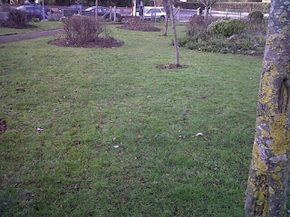
When we arrived there we talked our actors through the scenes that were taking place and experimented with positions and angles for the camera to make the most of the natural sunlight and to ensure the best shot was achieved that made the most effective use of space and the surroundings of the park, allowing us to maintain and establish this run down, lower class, inner city setting, with a broken bench, crumbling wall and fence and a run down smoking shelter all being situated within the shots.
With any fighting scenes there is a potential hazard to equipment and actors, as although you want it to look realistic you also want to ensure the actors and equipments welfare is kept at highest priority and below is the link to our risk assessment sheet looking at possible hazards on a whole, and so we rang the local police station to inform them that a staged fight was going to take place so that no distress was caused to neighbours or un-neccesary call outs were made:
Risk Assessment Day 2 Filming
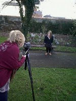 As these few shots in the park take the form of the bulk of our action shots, showing the fighting scenes within the quick edits of the trailer and reinforcing and representing the culture of Youths of the modern day, especailly those in run down city areas, who feel a need to fight to survive, we wanted the shots to be as best quality as possible, to create a realistic effect that would capture the audience. We began filming first with a mid shot of Erin sat on a bench looking lonely and out casted as an establishing shot and to also draw emphasis to the fact during the fight, which will become clear through editing, that Erin is in fact watching them attack the victim. We experimented with the zoom to see how close to her face we wanted the shot to be and allowing a connection with her eyes to be made with the viewer, and so we filmed for as long as possible before our actress became uncomfortable, so there was more footage to use and edit with during the editing process.
Our second scene to film was where we had to stage a gang fight. This involved the "gang", a group of friends from college, attacking a victim who is lying on the floor, with Erin looking on. As this could potentially damage the park or harm someone we had to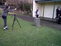 ensure that the actors knew exactly where to stand and what to do and how long for so that no one got distracted or was uncertain of what was going on, especially the actor playing the victim lying on the floor. We chose to start the shot with the victim lying on the floor as we thought that it would be dangerous to stage the fight right from the beginning where he would have been pushed to the floor, as the actor playing the victim could have been hurt. This also works in our favour as due to the fast paced nature of film trailers and quick cuts and edits it also means that a lot of establishing information is also removed and the most important, thrilling and action filled scenes are kept in and compiled together to create intensity and suspense which is what we will try to achieve through our own trailer.
We had to ensure that Erin was seen in shot watching on the fight while it took place, but also did not want to get any glare from the sunlight so we had to position the camera carefully as the bench we had originally intended to use, which faced towards the sun meaning the camera would be looking away from it, was in occupation by a dog walker. We took several takes of this shot and a close up shot of the victim being "kicked" to ensure that we had enough takes to choose the most realistic, as we found that the characte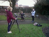 rs became more relaxed and confident as each take went on, however we feel that the first take was most effective as it captures the "fight" less staged as its the first time they had done it and therefore it looks less set up and were overall very pleased with the outcome of this take, deciding to extend the end and have the actors walk away from the victim leaving him lying on the floor, with Erin still looking on, before cutting to the shot of her legs walking towards the victim, keeping enigma and suspense and also making her character appear quite sinister and dark.
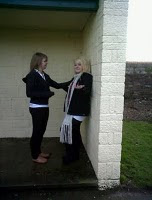 We then went on to film the girl gang member fighting with Erin. Our actors got very into this scene and in fact began tackling each other to floor on the path which we thought could be potentially harmful and so moved them to the grassier area, although their acting was superb due to them being close friends in real life and therefore we were very pleased with the outcome of this particular scene. We then also took an extra shot of them fighting in a run down smoking shelter with Erin pushing the girl gang member up against the wall as we thought this would be less harmful to the actors to carry out and also could be used as an extra shot in our film trailer if one of the other didn't film properly or didn't look as effective.
The most difficult shot to film was the worms eye view shot from the victims point of view looking upwards towards an onlooking Erin who is stood with her hood up looking down on the victim sinisterly, and then smiling. This was slightly problematic as due to the fact the camera had to be hand held to get it so low to the floor and ensure a steep enough angle was created there was an element of camera shake on the first few seconds of the shot. We overcame this problem by over shooting the scene, filming for as long as possible, to ensure that enough steady handed footage was recorded to enable as best possible outcome shot as can be achieved with the circumstances.
Overall i feel that Day 2 of filming was very successful as a whole and we didn't experience many challenges with our filming as it seemed to run fairly smoothly and as a whole i am happy, and we as a group, are happy with the shots we took and the footage that we have recorded ready fore editing, once the final scenes have been recorded, hopefully on Monday the 7th of February, next week.
Day 1: Filming Scenes 4,5(a & b),6,16,20,21,22 and 23
Classroom & Corridor
Our first day of filming took place on Thursday the 27Th January 2011, meeting the relevant actors at college before hand as the scenes we had chose to shoot on this day were the scenes that centred around a school environment to depict Erin, the lead characters shift in attitude, image and new found power amongst her peers. We met at around 3pm as this was the most convenient time for our actors and began filming in the Sandsfoot block of college which is the Science and Humanities department and therefore it has a more school like feel to the classrooms and corridors than some of the other buildings in College. Below is a link to the risk assessment sheet that was conducted before filming took place
CALL SHEET FOR FILMING AT PARK
We had a few problems that we encountered when organising this first initial filming day as we had set up and arranged to film the week before but the actor from the Performing Arts Group at College had still failed to get back to us the night before and so we felt that it was better to cancel and arrange another time and date a week later, giving more notice. We then changed the lead character to a friend of ours called Laura Gray as we knew that she was available at this time and therefore would not be let down by our lead and it worked out that everyone turned up on time and put maximum effort into their performances.
The filming itself took a little while for us to adjust back into as its been a while since we did our first assignment brief for AS Media Studies. We used a tripod to gain a steady image throughout and encountered a small problem when wanting to track alongside the lead character, Erin, walking down the corridor and concealing the knife up her sleeve as we had no way of making the movements slow, steady and consistent, as our own body movements through holding it made the filming jolty and jumpy. We decided that the best possible solution was to use a panning shot instead with the actor carrying out the same movement, but just showing the knife more so when she was closest to the camera during the pan as this makes it appear more subtle and also reinforces the idea to the audience that no one else can see the knife that she is concealing except them, keeping them involved in the story line and maintaining the connection and relatability with the lead character.
We also repeated each shot a number of times, from different angles and slightly different heights and zooms, fore example going from a long shot to a medium shot and vice Versa to ensure that we have enough to footage when beginning the editing process and that we also have a selection to choose from to gain the most professional edit. The scenes which involved a female teacher (4 and 22), which was played by the part of Sue Dafter, a lead Tutor here at College, as well as the scene where Erin attacks a girl from her school, were needed to be repeated more times as it involved Erin attacking the teacher as they went to leave the classroom and holding the knife against her throat and we needed Sue to look genuinely fearful and shocked at the happenings, as well as Laura's attack and attempt at pushing Sue into the wall was also realistic and did not look false and put on. We also needed to make sure that the actors didn't laugh when the 'Girl Gang Fight' took place as Laura had to haul herself across the corridor into Megan as if she was going to hit her and initially they found it humorous. Overall they both made very good attempts and after about three or four takes, they were all fully in character and we were able to get a very good result that looks realistic and un-staged and is also quite shocking to the viewer.
The corridor scenes which involved a number of actors and was meant to appear like an everyday school corridor with cliques and gangs separating themselves from each other actually worked very well. Our actors all arrived in white shirts and black trousers or a skirt, with hoodies and jewellery on to make their uniform their own, which was a major part of school dress sense when i was at school as many people wanted to rebel against the system and a lot of teenagers at this age tend to look fairly untidy, so this gave us a very realistic representation of age group for our characters and actors and also made it clear that they were attending school.
We had to repeat these scenes, again a few times, as on the first take Voni West, who is one of the girls that throws something at Erin and then calls her a 'freak', tripped her up as part of the bullying scene where everyone in the corridor is pushing her around and she appears alone and Laura was unaware that this was going to happen and began laughing mid scene. The second attempt was probably the most successful as although there was laughing at the very end of the shot, we will be able to edit this out easily and also the third shot we took, Megan, the girl who throw the paper was a bit late on queue and Laura had already left the frame before it hit her.
Day 2: Filming Scenes 7,8,9,10, 17 and 18
The Park
Our second scheduled day for filming took place on Thursday the 3rd of February and we met our actors in college with the filming equipment at around 3pm which was the most convenient time for both us and the actors we had asked to participate, before escorting them to the park, shown below, that is situated a couple of minutes walk from college, across the road on Carlton Road, Weymouth opposite the Hospital and the Park Pub and is situated in one of the most urbanised areas of Weymouth, therefore giving a more city feel.


When we arrived there we talked our actors through the scenes that were taking place and experimented with positions and angles for the camera to make the most of the natural sunlight and to ensure the best shot was achieved that made the most effective use of space and the surroundings of the park, allowing us to maintain and establish this run down, lower class, inner city setting, with a broken bench, crumbling wall and fence and a run down smoking shelter all being situated within the shots.
With any fighting scenes there is a potential hazard to equipment and actors, as although you want it to look realistic you also want to ensure the actors and equipments welfare is kept at highest priority and below is the link to our risk assessment sheet looking at possible hazards on a whole, and so we rang the local police station to inform them that a staged fight was going to take place so that no distress was caused to neighbours or un-neccesary call outs were made:
Risk Assessment Day 2 Filming
 As these few shots in the park take the form of the bulk of our action shots, showing the fighting scenes within the quick edits of the trailer and reinforcing and representing the culture of Youths of the modern day, especailly those in run down city areas, who feel a need to fight to survive, we wanted the shots to be as best quality as possible, to create a realistic effect that would capture the audience. We began filming first with a mid shot of Erin sat on a bench looking lonely and out casted as an establishing shot and to also draw emphasis to the fact during the fight, which will become clear through editing, that Erin is in fact watching them attack the victim. We experimented with the zoom to see how close to her face we wanted the shot to be and allowing a connection with her eyes to be made with the viewer, and so we filmed for as long as possible before our actress became uncomfortable, so there was more footage to use and edit with during the editing process.
Our second scene to film was where we had to stage a gang fight. This involved the "gang", a group of friends from college, attacking a victim who is lying on the floor, with Erin looking on. As this could potentially damage the park or harm someone we had to
 ensure that the actors knew exactly where to stand and what to do and how long for so that no one got distracted or was uncertain of what was going on, especially the actor playing the victim lying on the floor. We chose to start the shot with the victim lying on the floor as we thought that it would be dangerous to stage the fight right from the beginning where he would have been pushed to the floor, as the actor playing the victim could have been hurt. This also works in our favour as due to the fast paced nature of film trailers and quick cuts and edits it also means that a lot of establishing information is also removed and the most important, thrilling and action filled scenes are kept in and compiled together to create intensity and suspense which is what we will try to achieve through our own trailer.
We had to ensure that Erin was seen in shot watching on the fight while it took place, but also did not want to get any glare from the sunlight so we had to position the camera carefully as the bench we had originally intended to use, which faced towards the sun meaning the camera would be looking away from it, was in occupation by a dog walker. We took several takes of this shot and a close up shot of the victim being "kicked" to ensure that we had enough takes to choose the most realistic, as we found that the characte
 rs became more relaxed and confident as each take went on, however we feel that the first take was most effective as it captures the "fight" less staged as its the first time they had done it and therefore it looks less set up and were overall very pleased with the outcome of this take, deciding to extend the end and have the actors walk away from the victim leaving him lying on the floor, with Erin still looking on, before cutting to the shot of her legs walking towards the victim, keeping enigma and suspense and also making her character appear quite sinister and dark.
 We then went on to film the girl gang member fighting with Erin. Our actors got very into this scene and in fact began tackling each other to floor on the path which we thought could be potentially harmful and so moved them to the grassier area, although their acting was superb due to them being close friends in real life and therefore we were very pleased with the outcome of this particular scene. We then also took an extra shot of them fighting in a run down smoking shelter with Erin pushing the girl gang member up against the wall as we thought this would be less harmful to the actors to carry out and also could be used as an extra shot in our film trailer if one of the other didn't film properly or didn't look as effective.
The most difficult shot to film was the worms eye view shot from the victims point of view looking upwards towards an onlooking Erin who is stood with her hood up looking down on the victim sinisterly, and then smiling. This was slightly problematic as due to the fact the camera had to be hand held to get it so low to the floor and ensure a steep enough angle was created there was an element of camera shake on the first few seconds of the shot. We overcame this problem by over shooting the scene, filming for as long as possible, to ensure that enough steady handed footage was recorded to enable as best possible outcome shot as can be achieved with the circumstances.
Overall i feel that Day 2 of filming was very successful as a whole and we didn't experience many challenges with our filming as it seemed to run fairly smoothly and as a whole i am happy, and we as a group, are happy with the shots we took and the footage that we have recorded ready fore editing, once the final scenes have been recorded, hopefully on Monday the 7th of February, next week.
Day 3 Filming: Final Day- Scenes 2 (a&b), 3, 11, 12, 13, 14, 15, 24, 25 and 26
Bedroom, Kitchen, Road and Subway
The final day of filming took place on Monday the 7th of February after college and only included the actor who played Erin, along with the mother character who was played by holly, the other member of my groups own mother, as we filmed the house scenes at her house.
Firstly we filmed the daylight road scene, where Erin is seen walking along a housing street, with a number of cars parked, walking behind them along the street. We orginally had set this as a still medium shot however decided during filming that it could look more effective as pan shot, following her walking along the street, until she finally walked out of shot. We did experience some problems with outside influences as a car parked near by where we were filming and the children who were getting out were being fairly noisy, and so we had to wait until it was clear again as they were being picked up too clearly on the audio of the tape.
 We then filmed the scenes in the house, of the bedroom, bathroom and kitchen. We used Holly, a member of ours groups bedroom, so that it was not a problem to stage the "trashing of the bedroom" scene where Erins character changes and she throws things around her room in anger and desperation at her loneliness. We did experience some problems with the size of the room as the camera did not capture a wide enough shot to include everything we wanted within the scene of Erin sat on the bed, just after she opens her eyes. We moved into the corner as far back as possible and eventually managed to get a shot that we were happy with that made the bed visible and the blank wall behind her. For the scene with the throwing of belongings, we placed the camera and myself and Holly outside of the room, with the camera in the doorwa
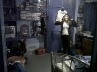 y looking in, firstly so that the equipment would not be damaged and also because this scene
 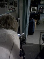 was meant to reperesent Erin's frustration and anger with her life and the fact that she keeps everyone at a distance from her, keeping the camera and ultimately the audience at a distance. We shot this scene three times as each time would obviously come out differently as you cant really plan where things land, although we had set out objects on the bed, hidden behind the wall, for the actor to throw and found this scene came out very realistic and effectively, as she played the character very well and it seemed realistic and angry.
 For the scenes that took place in the bathroom with the mother banging on the door shouting at Erin, and her stood looking into the mirror and then cutting her hair off, we wanted these scenes to be fairly emotional, as they represent and portray Erins transition of character as she takes on anger and violence as her only escape of loneliness, bullying and poverty. We filmed this scene a number of times from slightly different angles to gain the best shot of her facial expression in the mirror and to also make it clear when she picks up the scissors to cut her hair. As we had to physically cut hair, to show the scene of the hair falling to the floor by her feet, in front of the mirror, we used some of our actors old hair extensions that were unwanted and unused so that no ones real hair had to be cut, this also meant that the hair looked more realistic as we had orginally planned to use a wig which may have looked cheap and tacky or given off a comical effect which is not the mood we wanted to create as our genre is action thriller.
 We then filmed the scenes of the kitchen, where the mother is shouting at Erin, while drinking and then Erin pushes her alcohol off of the kitchen units onto the floor, as a symbolic representation of her having enough of her negative life. As we had to actually push some glass alcoholic bottles of off the units we needed to pad the floor with cushions and blankets to ensure that none of the bottle broke, although there was the possibility of some of them hitting each other. We repeated this scene twice, once a close up of them being pushed off the counter and another time from a more mid shot point of view so the audience are able to actually see them falling and we then plan to add the smashing sound in at a later date once the editing process is under way, as we have another smashing bottle scene later in the trailer. We asked hollys mother to dress in jeans and a hoody so that she appeared quite plain and asked her to hold a beer can in her hand as opposed to a glass, again, to reinforce this lower social position and the hardships associated with money problems, such as alcoholism.
For the scenes outside in the Littlemoor subway and nearby surrounding road, we decided again that we should ring the police station to inform them that we would be filming a smashing bottle scene, but planned to clean the glass up afterwards with a dust pan and brush. As this is a potentially dangerous scene we had to plan it very carefully and made sure that she threw the glass bottle a fair distance away from her for the shot where it smashed, with practise shots and various other shots for editing havbing her roll it along the floor to ensure it didnt shatter on her. Due to the fact we were filming at night we also had to use the lighting from the tunnel, which was fairly bright anyway and created quite a lonely feel to the shots, which was exactly what we had wanted. The scene of her walking alone at night did come out fairly dark however due to the fact that the streetlamps nearby were not very effective, although this could work to our advantage as we wanted the shot to connote an idea and feeling of loneliness and danger which is shown through the lighting and pathetic fallacy.
Overall now that the filming process has been completed over the three days i feel that as a group we have done very well in creating the scenes and shots that we had initally set out and planned to create. i think that we have been so successful due to the careful and detailed planning and story boards and scripts that we made, as we knew exactly what shots and scenes we wanted to create, which meant that most of our effort could be put into ensuring it was perfect rather than deciding how to go about filming. From experience we also knew that it was best to take as many takes as possible of the same shot, to allow a more professional edit, due to a wider choice of scenes. The fact that we also knew the actors well, as they were our own friends, made it much easier to communicate when filming and made us more confident in terms of telling them how to act, where to look and where to go as there was no awkwardnes between us. Our previous experience with the equipment from AS media has also helped a great deal as we knew how the camera and tripod worked which gave us more freedom in our shot types and compositions, although we felt that it was particularly difficult to attempt a tracking shot, due to lack of equipment that would make it smooth and steady. Personally i think that the biggest problem we faced when filming, initially, was lack of communication with actors, as the actor we had initially lined up to play Erin was very hard to get hold of and didnt tuen up to a filming day that we had arranged, however we fixed this quite quickly by asking one of our friends to take part, which overall has worked out for the better, due to the fact some of the scenes needed to be so personal and emotive and this may not have been as realistic or effective if the part had been played by someone who didnt know us very well and may have felt uncomfortable.
The final day of filming took place on Monday the 7th of February after college and only included the actor who played Erin, along with the mother character who was played by holly, the other member of my groups own mother, as we filmed the house scenes at her house.
Firstly we filmed the daylight road scene, where Erin is seen walking along a housing street, with a number of cars parked, walking behind them along the street. We orginally had set this as a still medium shot however decided during filming that it could look more effective as pan shot, following her walking along the street, until she finally walked out of shot. We did experience some problems with outside influences as a car parked near by where we were filming and the children who were getting out were being fairly noisy, and so we had to wait until it was clear again as they were being picked up too clearly on the audio of the tape.
We then filmed the scenes in the house, of the bedroom, bathroom and kitchen. We used Holly, a member of ours groups bedroom, so that it was not a problem to stage the "trashing of the bedroom" scene where Erins character changes and she throws things around her room in anger and desperation at her loneliness. We did experience some problems with the size of the room as the camera did not capture a wide enough shot to include everything we wanted within the scene of Erin sat on the bed, just after she opens her eyes. We moved into the corner as far back as possible and eventually managed to get a shot that we were happy with that made the bed visible and the blank wall behind her. For the scene with the throwing of belongings, we placed the camera and myself and Holly outside of the room, with the camera in the doorwa y looking in, firstly so that the equipment would not be damaged and also because this scene
  was meant to reperesent Erin's frustration and anger with her life and the fact that she keeps everyone at a distance from her, keeping the camera and ultimately the audience at a distance. We shot this scene three times as each time would obviously come out differently as you cant really plan where things land, although we had set out objects on the bed, hidden behind the wall, for the actor to throw and found this scene came out very realistic and effectively, as she played the character very well and it seemed realistic and angry.
 For the scenes that took place in the bathroom with the mother banging on the door shouting at Erin, and her stood looking into the mirror and then cutting her hair off, we wanted these scenes to be fairly emotional, as they represent and portray Erins transition of character as she takes on anger and violence as her only escape of loneliness, bullying and poverty. We filmed this scene a number of times from slightly different angles to gain the best shot of her facial expression in the mirror and to also make it clear when she picks up the scissors to cut her hair. As we had to physically cut hair, to show the scene of the hair falling to the floor by her feet, in front of the mirror, we used some of our actors old hair extensions that were unwanted and unused so that no ones real hair had to be cut, this also meant that the hair looked more realistic as we had orginally planned to use a wig which may have looked cheap and tacky or given off a comical effect which is not the mood we wanted to create as our genre is action thriller.
 We then filmed the scenes of the kitchen, where the mother is shouting at Erin, while drinking and then Erin pushes her alcohol off of the kitchen units onto the floor, as a symbolic representation of her having enough of her negative life. As we had to actually push some glass alcoholic bottles of off the units we needed to pad the floor with cushions and blankets to ensure that none of the bottle broke, although there was the possibility of some of them hitting each other. We repeated this scene twice, once a close up of them being pushed off the counter and another time from a more mid shot point of view so the audience are able to actually see them falling and we then plan to add the smashing sound in at a later date once the editing process is under way, as we have another smashing bottle scene later in the trailer. We asked hollys mother to dress in jeans and a hoody so that she appeared quite plain and asked her to hold a beer can in her hand as opposed to a glass, again, to reinforce this lower social position and the hardships associated with money problems, such as alcoholism.
For the scenes outside in the Littlemoor subway and nearby surrounding road, we decided again that we should ring the police station to inform them that we would be filming a smashing bottle scene, but planned to clean the glass up afterwards with a dust pan and brush. As this is a potentially dangerous scene we had to plan it very carefully and made sure that she threw the glass bottle a fair distance away from her for the shot where it smashed, with practise shots and various other shots for editing havbing her roll it along the floor to ensure it didnt shatter on her. Due to the fact we were filming at night we also had to use the lighting from the tunnel, which was fairly bright anyway and created quite a lonely feel to the shots, which was exactly what we had wanted. The scene of her walking alone at night did come out fairly dark however due to the fact that the streetlamps nearby were not very effective, although this could work to our advantage as we wanted the shot to connote an idea and feeling of loneliness and danger which is shown through the lighting and pathetic fallacy.
Overall now that the filming process has been completed over the three days i feel that as a group we have done very well in creating the scenes and shots that we had initally set out and planned to create. i think that we have been so successful due to the careful and detailed planning and story boards and scripts that we made, as we knew exactly what shots and scenes we wanted to create, which meant that most of our effort could be put into ensuring it was perfect rather than deciding how to go about filming. From experience we also knew that it was best to take as many takes as possible of the same shot, to allow a more professional edit, due to a wider choice of scenes. The fact that we also knew the actors well, as they were our own friends, made it much easier to communicate when filming and made us more confident in terms of telling them how to act, where to look and where to go as there was no awkwardnes between us. Our previous experience with the equipment from AS media has also helped a great deal as we knew how the camera and tripod worked which gave us more freedom in our shot types and compositions, although we felt that it was particularly difficult to attempt a tracking shot, due to lack of equipment that would make it smooth and steady. Personally i think that the biggest problem we faced when filming, initially, was lack of communication with actors, as the actor we had initially lined up to play Erin was very hard to get hold of and didnt tuen up to a filming day that we had arranged, however we fixed this quite quickly by asking one of our friends to take part, which overall has worked out for the better, due to the fact some of the scenes needed to be so personal and emotive and this may not have been as realistic or effective if the part had been played by someone who didnt know us very well and may have felt uncomfortable.
Monday, 29 November 2010
'Raze' Planning Progress
As the production paper work begins to come to a close we are getting ever closer to being ready to shoot our film trailer. We have produced precise and well thought out scripts and story boards as shown below and have begun to email other college departments to start the screening process for finding the appropriate actors. We have decided on all locations for the shots that we have planned out within the storyboards and script and therefore have also completed reccee assessments of the areas and know the dangers and hazards that may face us, as well as problems that may be created by the areas and are ready to tackle them head on and begin filming once the actors are chosen.
Below are the story boards and the script that we have created in preparation for our production of our film trailer, entitled 'Raze' to allow us to plan and prepare the shot sequences and also decide and come to a final agreement on what shots and scenes we want to depict and include within our trailer to make it most effective and most enthralling as a viewer to watch, keeping enigma flowing and ensuring the narrative also flows well to create a good storyline and a trailer that will create an urge for the viewer to want to find out more. We have chosen to the title Raze due to its meaning; to flatten, destroy and wipe out, representing the destruction of Erin self, in terms of personality and character which is depicted within the film and the trailer due to the negative influences and experiences that she encounters within her everyday life. The Script, which gives the shot sequences and dialogue in more detail and in a clearer format for reading as a producer during production. Script for 'Raze'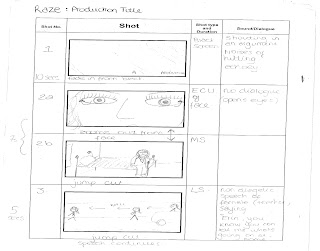
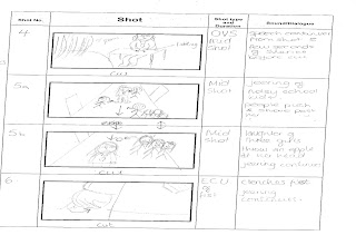


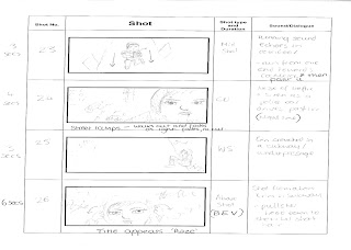
We have now emailed (email1) (email 2)the drama department at our college in an attempt to try and gain some more professional and serious actors to take part in our film trailer as we want the acting to be realistic to enhance the social realism of the content and make the characters more connectable with by the audience. We have received a reply with good news that there is a female student willing to take the lead roll of Erin for our film which will make the acting more relastic and also she has also got short hair which will make the hair cutting scene much easier to carry out.
Below are the story boards and the script that we have created in preparation for our production of our film trailer, entitled 'Raze' to allow us to plan and prepare the shot sequences and also decide and come to a final agreement on what shots and scenes we want to depict and include within our trailer to make it most effective and most enthralling as a viewer to watch, keeping enigma flowing and ensuring the narrative also flows well to create a good storyline and a trailer that will create an urge for the viewer to want to find out more. We have chosen to the title Raze due to its meaning; to flatten, destroy and wipe out, representing the destruction of Erin self, in terms of personality and character which is depicted within the film and the trailer due to the negative influences and experiences that she encounters within her everyday life. The Script, which gives the shot sequences and dialogue in more detail and in a clearer format for reading as a producer during production. Script for 'Raze'


We have now emailed (email1) (email 2)the drama department at our college in an attempt to try and gain some more professional and serious actors to take part in our film trailer as we want the acting to be realistic to enhance the social realism of the content and make the characters more connectable with by the audience. We have received a reply with good news that there is a female student willing to take the lead roll of Erin for our film which will make the acting more relastic and also she has also got short hair which will make the hair cutting scene much easier to carry out.
The locations for our films have been brainstormed (location brainstorm) and we then thought out possible places within Weymouth that we might be able to find these types of settings and locations (location ideas). We have now also finalised these locations and picked the ones most appropriate to the style of the film and the atmosphere that we want to create, and reccees have been drawn up for each individual place that we have chosen.
Subscribe to:
Comments (Atom)