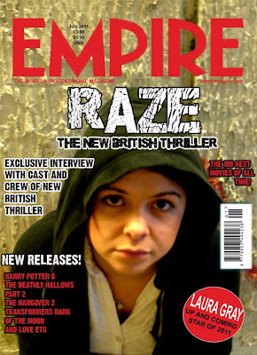
 This is the magazine cover that we have created using the template model from the well known and firmly established film review magazine 'Empire'. As we wanted to conform to the codes and conventions of a recognisable brand we used the same colour theme of red and white for the text that was added to the image that we took in our own photoshoot with the lead character at the subway location which features in the final shots of our trailer, specifically the last shot, and most close up and personal shot of Erin that we see throughout the sequence of shots, therefore making it more memorable and effective to use for other advertisements and promotional aspects of the film.
 The subway also establishes the social realist aspect of the genre of our film very well, creating a stereotype of an inner city area and therefore immediately establishing our primary audience of youths of a similar age that can relate to the character.
We used the exact font used within the 'Empire' logo to make the magazine cover look authentic and stuck to a close template that we had found from research to make it appear as realistic as possible.

The image itself that we used for the background of the magazine cover was a close up shot of Erins face replicating the final scene of the trailer. We wanted the image to be gritty and connective and so got the model and lead character to look directly into the camera itself, as the eyes are the most connective aspect of the body and portray emotion and mood perfectly. Through Laura's eyes you can see the loneliness of her character and the poverty of the world that she lives in. The fact that her hood is up also connotes the stereotype of 'hoody' youths and this agressive and dominant traits that the media has assigned to many youths living in more economically deprived areas of the cities of the UK. This emotion that is created through her eyes combined with the stereotype of the 'hoody' however makes her appear very vulnerable and unhappy as opposed to someone that the public should fear which was the message we were trying to get across, showing that some youths fall into this way of life, not by choice but by the fact it is the only way to survive or try and escape the lives they already lead.
In creating the magazine cover itself we used Adobe Photoshop CS3 for Apple Macs and uploaded the image into the program before cropping the image to make her eyes the central point of the image and therefore the focal point, leaving enough space at the top of the image for the font and title of 'Empire' the well established brand that will be the bait for creating an audience, who are alrady avid and loyal readers of 'Empire' film review magazine which has many large titles take front cover of its magazine across the months.

We then cut, copied and pasted a bar code from an exisitng magazine cover that we had looked at in research to ensure that the magazine cover looked authentic as possbile and placed it in the same place. We found that there was quite a lot of extra text and information about the content of the magazine on many of our research magazines and so thought carefully about what could go on the front cover including upcoming films from a similar genre, or with a famous and well known title and background or actors.
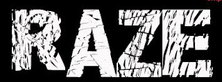
 We then created our own font face for the title of our film 'Raze' using a downloaded front through Adobe Photoshop entitled "Distorted and Scracthy" as the word Raze itself connotes a very sliced up and destructive image, the graphological and lexical cohesion works brilliantly in reinforcing the genre of a gritty and stripped bare film looking at the every day life struggles of a young girl from a socially and economically deprived background.
We used a circular pin attacthed over the bottom of the image using Photoshop to include the models name and suggest that she is an "up and coming star of 2011" giving the film status as for such a well established magazine like Empire to give a title like that will mean that the audience and readership are more likely to accept the ideology and accept the idea. We also wanted to reinforce this idea of how we were looking at British culture specifically and as this magazine is also available in the United States we wanted British people to feel a sense of collective identity when seeing this film. Many youths, being the primary audience, of a similar age and background to the lead character Erin may be facing home and money troubles of their own and therefore allows this to be seen as normal as opposed to something to be ashamed of, or needing to lead to drastic measures.
We wanted to show what can happen, giving a reason as to why some youths may go into crime and homelessness as a way of escaping their home life, giving a reason as to why this stereotype may be rising among young people, although the media press surrounding it is usually very negative, not looking at the vulnerability of these youths and the loneliness they may feel. For this reason we used the tag line " THE NEW BRITISH THRILLER", allowing an immediate recognisation and connectability with the British public as we have a quite a strong sense of nationalism within our country, therefore establishing the basis of our audience, then specficically targeting youths and young adults in terms of the content, characters and narrative.
Overall i am very pleased with the outcome of our magazine cover as it looks authentic and conforms to the common codes and conventions used within Empire Magazine Covers that i have looked at for research, although there are a few areas that we could improve on. The image itself is slightly out of focus although this can add to the images effect, as it reinforces the gritty nature of the film and also shows that the real Erin is not completely visible to the audience, as he hides behind her front of voilence.
When trying to take the Empire logo and place it onto our own image we also experienced problems with pixellation due to copyrighting, and this was the best that we could achieve with only a minor pixellation on a few letters. The typography that we chose to use for our own title of the film, Raze, captures the mood and narrative of the film perfectly, entitled 'Distorted and Scratchy' which is used throughout our brand, gives the words themselves a rough and raw texture to them which also represents the word Raze, meaning destruction, accurately and keeping the theme of the brand.
Raze Magazine Cover
No comments:
Post a Comment